The latest in accessibility – milestone measures in 2021
In essence, our development has focused on two fundamental pillars of accessibility: keyboard operability for the web app to ensure users don’t need a mouse and the screen reader function. Can all functions in the web app be controlled by pressing the tab key? Is it clearly visible which control element is currently active? Can users navigate to “smaller” controls without any problems? And are there saved texts describing the entire interface so that a screen reader can read the page with no gaps?
Here’s a summary of all the steps taken in the last six months:
July 2021
Keyboard usability on the home, login and registration pages: Our first steps towards an accessible app involved making the start, login and registration page keyboard-accessible. Users can thus navigate through the pages using the tab key. Users with motor impairments and those who use screen readers depend on being able to move around the page without a mouse. We enabled this by rearranging and restructuring individual elements in a hierarchy and making buttons and navigation elements visually distinctive.
August 2021
Screen-reader readability on the home page: The next accessibility milestone was the home page of our web app, where blind or visually impaired users can “see” the page through their screen readers. The screen reader reads the start page to the user in such a way that they can distinguish between these texts, areas, buttons and navigation elements.
September 2021
Screen-reader readability on the registration page: In September, we expanded screen-reader capability to the registration page. Blind or visually impaired users are now able to register and navigate through the registration page. It is now also possible to “see” elements such as input fields, checkboxes, text and links through voice output.
October 2021
Registration page click areas: The user interface is easier to use if the control elements are easier to see and type. Click areas have therefore been defined for the respective checkboxes on the registration page to increase accuracy. Links within the texts can still be used and lead to the desired destination.
Input field component on the registration page: The realignment of the component architecture was implemented for the input fields. Texts now have a new font size and the more flexible REM unit instead of fixed pixels. A short digression into web design: REM is a relative unit that refers to the root font size, a bit like percentages. All elements refer to a standard size of, for example, 16px = 1rem, so the heading H1 = 48px = 3rem. For people who need to change the base font size by zooming in, the entire text is scaled proportionally without affecting the harmony or hierarchy of the different font sizes.
November 2021
Checkbox component on the registration page: People with motor impairments can sometimes have trouble hitting the box of a checkbox accurately. The description text was thus made clickable. The visual marking of the active checkbox is also highlighted more clearly. The checkbox labels were additionally given a new font size, and all the margins and element sizes on the registration page were adjusted accordingly.
December 2021
Bug fixes and style corrections: Following the conversion measures and more intensive testing, we noticed bugs that called for attention at the end of the year. We were able to make visual adjustments and corrections to the smartphone display and refine the styling, such as by eliminating the hover effects in checkboxes.

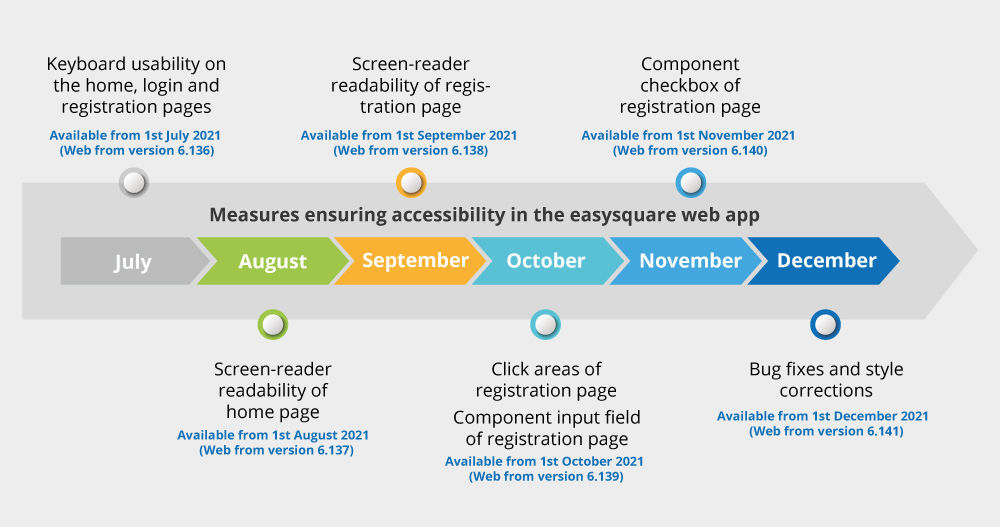
An overview of all measures to enhance accessibility in our easysquare web app in the second half of 2021.
More information on accessibility:

