A fresh look – the new Generic Style for easysquare apps
The Generic Style – the right design for every area
No matter which tile users jump to in the easysquare apps, they’ll find a complete list of entries (i.e. forms) waiting for them in a preview view. In the marketplace area of the easysquare tenant app, for example, you’ll find an overview of all offers and requests, and in the easysquare rentals app you’ll see all open rental units under “Properties”. To avoid having to jump into each individual form, it is particularly helpful for users if the preview list already provides the most important information about the actual entry in a clear, uncluttered manner. What matters is therefore not only the question of what is presented, but also how. However, this can vary significantly from area to area. A preview in the rental properties space may primarily contain the rental price, the area in square metres and photos of the apartment, but for an open property inspection, the address, name and inspection date will be more important for the property manager. This is why the Generic Style can be customised for the individual areas in all easysquare apps.
The Generic Style tool set – versatile, individual and freely combinable
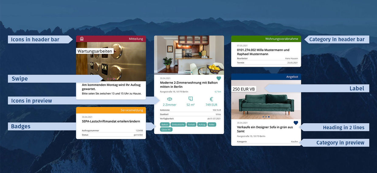
In addition to the option of wrapping the form preview list headers across two lines, which was an initial catalyst for creating the Generic Style, there is now a wide range of elements for designing preview lists in the easysquare apps. These include icons, labels, categories or badges, which can be incorporated in different locations and freely combined with each other. Customers can use this tool set to define a fixed design for the respective app area, lending all entries in the preview a uniform look and presenting the relevant information to the user at a glance. A quick look at the best design elements of the Generic Style:
- Labels on pictures: Whether a price, discount or just a note, a label on the picture gives you quick and clear impression of the most important information in the entry.
- Picture swipe: Long-awaited by many, it is now possible to swipe between different images in the preview thanks to the Generic Style.
- Categories: Differentiated by colour in the preview or clearly arranged in the header bar, categories can specify the content of the entry in the preview.
- Icons: The small, practical icons can be displayed in the main body or in the header bar of the preview. They also facilitate information intake and are particularly attractive for the user.

The Generic Style has various tools enabling an even more attractive design for form preview lists in easysquare.
Areas of application – practical for every user
The Generic Style can be used in all easysquare apps. Whether tenant, property manager or potential tenant – all users benefit from an attractive presentation of the data relevant to them. This enables a quicker intake of information and significantly enhances the user experience, which leads to more frequent use of the app.
Would you like more information on the Generic Style? Please feel free to get in touch with our experts on the easysquare team. We look forward to receiving your message.
You may also be interested in:

