Brand new design – easysquare with unparalleled look and feel
This change will make the overall application even better to use, since the new design offers more options for customising the various apps.
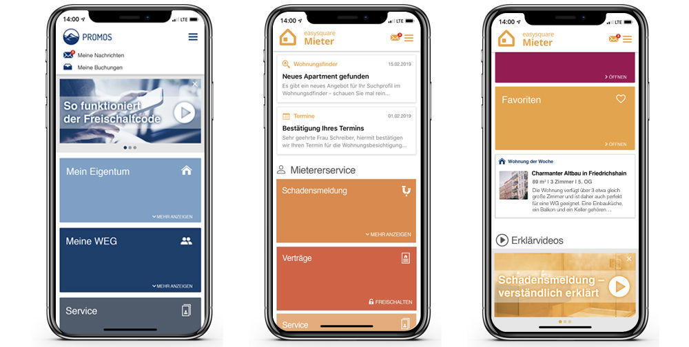
The services will be presented as tiles that can be opened to reveal more functions. It will be possible to add additional services to the permanently visible area on the app’s main menu according to the user’s wishes (e.g. “My Messages” or “My Bookings”).
Furthermore, widgets will display useful information within the app (e.g. “Confirm Your Appointment”) that can be opened directly.
These new and reorganised elements reduce the click depth for the user, since functions are not hidden in submenus.
Both pictures and videos can be shown in the carousel (e.g. “How the Activation Code works”). The parameters for individual use have been optimised to allow the tenant to also hide a carousel.
The new design is highly responsive – whether used on a smartphone, tablet or desktop, the design always optimally tailors itself to any device, making for a pleasant and intuitive user experience.
If you have any questions on this, feel free to contact us.
Our experts will be happy to advise you.

Disclaimer:
All rights reserved. Reproduction only with the express written permission of the author. All anticipatory statements depend on various risks and uncertainties that can lead to the actual results regarding dates and announced functional scope deviating from the above descriptions. PROMOS moreover retains the right to adjust and change dates and functional scope and to enhance functionality at any time. The above description of functionality and scope does not claim to be complete and may contain errors, for which PROMOS shall bear no liability.

