With the Fiori® Design Guidelines for the new fast entry of maintenance orders
Not only is it a real treat for the eyes, it also provides an application experience that will finally allow long-term SAP® users to truly enjoy themselves. Solutions have been completely reworked in accordance with the Fiori® Design Guidelines. First, we intensively examine our frequently-used products before transferring them to SAP Fiori® as counterparts with revised content. In this context, around two years ago, we started designing a Fiori® solution for fast entry of defect reports and maintenance orders. This is based on our popular SAP® ERP solution OpenPromos® Service Notification (OPSN). We would now like to present a preview from our development with this first interim status report.
Solution content
What are the core properties of the OPSN fast entry screen that will also form the basis for our new solution for SAP Fiori®? OPSN has always stolen the show above all through its simplicity. Even inexperienced employees can use it to create reports with the help of the system. The damage symptom for a functional location is recorded by selecting from a catalogue. OPSN is optimised so that an automatic supplier determination is stored when a specific catalogue selection is made (damage symptom). Creating the report automatically generates the entire document chain (report, order, purchase requisition and purchase order) in SAP®. Users stay in the same template throughout the entire recording process. No wonder the solution is so attractive for the housing and real estate industry! OPSN will still be available in this form in the future. With the new development project for SAP Fiori®, an entirely new version is being created in parallel for fast entry.
How might this look? We would like to give you a sneak preview here.
Design
We took the creation of a new solution for defect reporting in Fiori® as an opportunity to put together an expert team of employees from the maintenance and Facility Management fields with almost a century of experience between them and to decide which functions the new solution needed to provide. The objective was to make use of the best of the existing approaches and develop an entirely new solution. The intelligent fast entry template is slightly different for almost every customer. We took a good, hard look at every function before deciding whether to transfer it to the new solution. The framework for the design was the official SAP Fiori® Design Guidelines, although the word “design” is a little misleading here – they are not specifications for graphic design, but deal with aspects of functionality and operation. At the end of the intensive workshops, we had a solution that our developers are now working on step by step. An interim result already exists.
OPSN – the new fast entry solution in Fiori®
First, we will provide a rough overview of the new application before giving a deeper insight into the individual design principles.
Several consecutive steps are required to create a maintenance order. The Fiori® principle involves breaking down such processes and transferring the individual steps into separate applications, and therefore tiles, in a sensible way. Our analysis culminated in the decision to develop four tiles for the new fast entry, namely the
- search for the functional location for the real estate object
- actual report creation
- placing of a purchase order with a trade company
- actual commissioning.
Users now have the option to enter the process at the different points via separate tiles. However, this certainly does not mean that those who want to work through the entire process have to jump from tile to tile. Fiori® seamlessly links the individual steps so that users don’t even notice that they are moving through different applications. But which of these factors are the Fiori® Design Guidelines and how are they reflected in the current development status?
Fiori® is simple. Reducing complexity.
An important principle of Fiori® is its simplicity. As such, Fiori® represents the exact opposite of the original overcrowded SAP® GUIs. When designing the fast entry template for Fiori®, we also focused on keeping the solution simple. The search for a functional location generates a results list. If a user selects a certain functional location, a detailed view opens in the usual, very practical Fiori® split-screen view. This enables users to still have an overview of the results list on the left while also viewing fields such as address, contract partner, report history and functional location designation (Figure 1). If the user has selected the wrong object in the search results, they can quickly and conveniently jump to another object. In this way, the split screen gives users a fast and uncomplicated overview of a range of information at various points in the process. At the same time, the use of split screens allows work steps to be completed with significantly fewer clicks.
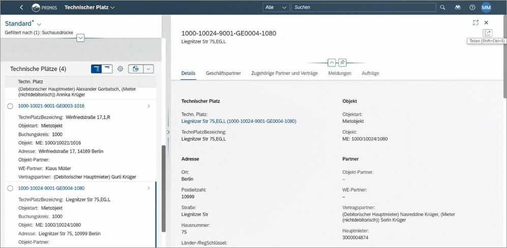
Figure 1: Split screens support users at various points in the application. Left: Results list from the functional location search, right: Detailed view of the selected functional location.
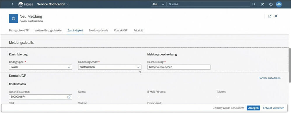
Figure 2: The report creation takes place using a tidy entry screen that focuses on the important things.
We also made sure to concentrate on the most important things while designing the new solution. For example, the report creation only contains the required fields and also benefits from selection fields for the catalogue, which makes entry much easier (Figure 2). The user selects the notification type, code group and code, which then generates a report description. The method of receipt, priority and some other other selected information can also be added. The entry screen has been greatly reduced and its graphic design is tidy and clearly structured. The “Create” button (highlighted in blue) at the end of the page completes the entry.
Fiori® is roles-based. Individual, authorisation-specific interfaces.
Users see exactly what they need – and only what they need. This is the compelling argument for SAP Fiori®. The times in which we had to remember transaction codes to be able to jump to the required areas of the SAP® system are now a thing of the past. In the Fiori® Launchpad, precisely those applications that the user actually needs are displayed, based on their role. What does this mean for the design of the new fast entry solution? Customers using the solution can freely decide which tiles are shown to which of their users. For example, if a specific user group is only authorised to record maintenance reports but not to commission a trade company, this group only sees the first two tiles of the workflow (Figure 3). This greatly reduces the complexity for users. In addition to the tiles in the Launchpad, users can also arrange other areas of the interface individually, but solely within the framework of their authorisations. For example, if a user clicks on a functional location, links to other applications are displayed (Figure 4). From here, a specific user can have the system display a functional location or create a maintenance report for it. The user can also select other links from a list that are necessary for their daily work. Of course, only the links for which the specific user has the authorisation are displayed.

Figure 3: Tiles in the workflow can be hidden and shown on a user specific-basis according to authorisation level.
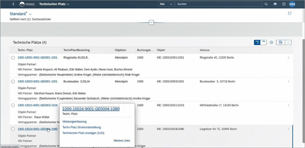
Figure 4: In the pop-up window, users can jump to other areas or adjust the links list according to their individual needs.
Fiori® is coherent. Intuitive operation and uniform design.
The user interfaces for the Fiori® apps all follow a common operational and design concept. In addition to the intuitive tile design, the uniform design principles allows users to instinctively get to grips with the apps. For example, objects highlighted in blue always contain further links for the user to choose from (Figure 4). Mandatory fields are marked with a red asterisk. Users are already familiar with this from other solutions. A button to display more information for each line of a list can also be found in various areas of the solution. This function can be used, for example during the search for a functional location to show and hide additional information on the contract partner and accounting entity for each results line (Figure 5). This allows users to easily gain an overview of more in-depth information. The same principle also applies to the output list for the report history of the functional location. In terms of content, a global search function provides support with navigation through the system. For example, if the user enters “Krüger” in the search field when searching for a functional location, all accounting entities relating to “Krüger” are displayed – no matter whether “Krüger” is in the name of the street, the contract partner or the town.
Fiori® is adaptive. The office on the go.
In our private lives, it’s already a matter of course that almost every digital solution fits in our pocket – whether for route planning, banking or shopping. And we are also starting to use more and more solutions on mobile devices at work. Our easysquare mobile cloud solutions have led the way, but we also frequently use MS® Teams and other MS® Office applications while on the go. So it’s almost revolutionary that, with Fiori®, SAP® can now also be used on any imaginable device. It is browser-based and responsive. This means that, in the future, there will be no more barriers to fast entry of defects and maintenance orders on site.
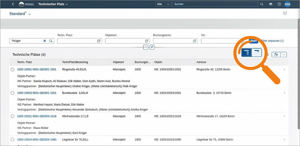
Figure 5: Show and hide list information using uniform buttons.
Fiori® is delightful. Enjoyable operation for every user.
For us, the implementation of the final criterion of the Design Guidelines is a kind of result or interplay from the fulfilment of the other four criteria. An application that is tailored to me and my needs, reduced to the most important things, features high usability and adapts to any imaginable device is quite simply delightful. And this is extremely important for every application case. Users often reject new IT solutions. If the application is fun to use, this will fundamentally contribute to acceptance. The training requirement is also considerably reduced. The tile-based design of the application, the input fields that are condensed down to only the essentials, split screens, global search fields, navigation opportunities and a clear, uniform design mean that, in the future, the solution will be a fantastic application for various user groups.
A summary of the design phase
We have always aspired to constantly improve PROMOS solutions and to make new functions from customer projects available to other companies as well. In designing a new solution for the fast entry of defect reports and maintenance orders in SAP Fiori®, we are taking a step into a new era. Our solutions are being reduced down to their core and then supplemented with only the functions that you – our customers – have judged to be useful and valuable over the years. It is only with your help that we are where we are today and able to approach the next development steps with our findings and your requirements from the past few years. We have achieved an important milestone and already developed the first two tiles – as the images clearly demonstrate. We are looking forward to reporting on further development steps soon.
redaktion@openpromos.de
