A brilliant new look – Get transactions into shape with SAP® Screen Personas
We’ve all been there. Anyone who has laboriously tinkered with a website on their smartphone screen – be it to buy a last minute ticket at the train station or to spontaneously find the ingredients for a traditional lasagne at the supermarket – will be familiar with this struggle. There is one thing we can all agree on: poor usability is frustrating. Websites and application interfaces need to be tailored differently for various devices. The display area must be considered here to avoid unnecessary scrolling. Content should be reduced to essential elements, and font sizes and hierarchies must be readable and recognizable
It is no different with the SAP® GUI transactions that we work with on a daily basis. Complex input screens are not very suitable for tablets and other small devices. Nevertheless, mobile terminal devices have been adopted in our industry and are here to stay. A typical maintenance application case is the creation of notifications. When a caretaker discovers a defective light in a hallway or sees that an elevator is not working, such faults must be recorded in the central IT system in order for relevant repair measures to be taken. One option for this is to create a maintenance request on the caretaker's tablet. To configure the (very comprehensive) SAP® standard transaction “IW26 – Create Maintenance Request” for the caretaker to use on site, you can turn to the free SAP® Screen Personas add-on.
This is a browser-based low-code development platform in which work surfaces can easily be redesigned or personalised with a drag-and-drop function. The individual elements can be flexibly moved around the drawing board without any support from developers. The user can easily hide unused fields, change the appearance of existing elements or embed their own buttons for certain actions or links. With the Slipstream Engine – a component included in Version 3.0 – it is finally possible to render individually designed user interfaces on mobile devices. SAPUI5 libraries are used in the background to create the look and feel of Fiori®.

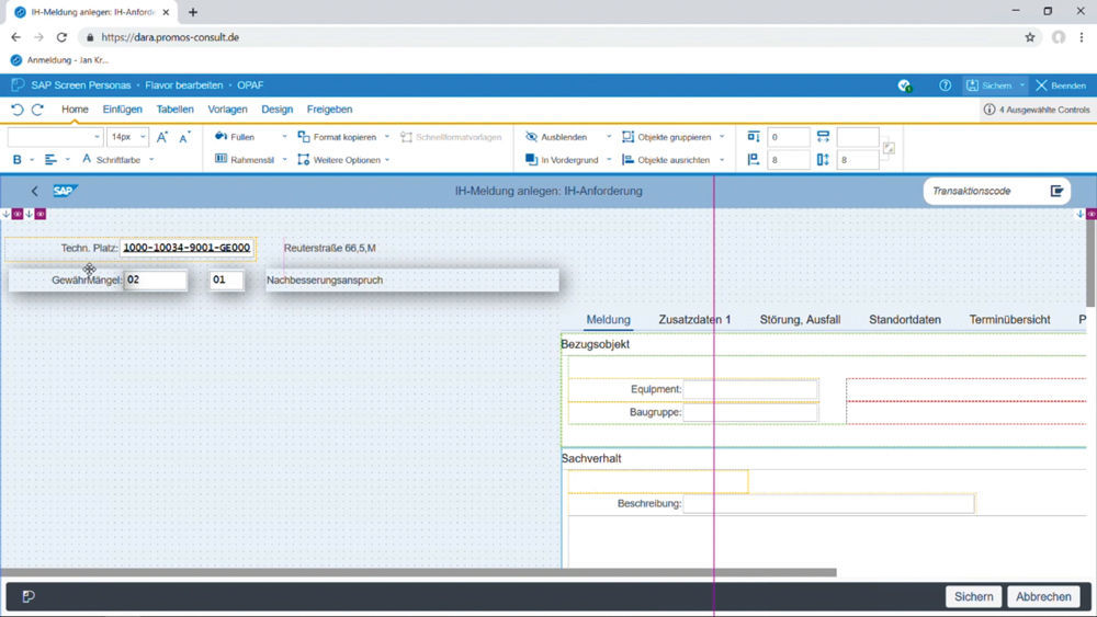
Figure 1: The individual notification fields can be placed with utmost ease in the flavor editor through a drag-and-drop function.
Less is often more
There are a few things to think about before you slip into the role of UX designer. Let's begin with the content. What information do we need from the caretaker? In which order should the data be queried? Sometimes not all data fields are necessary. The standard transaction IW26 is far too extensive to be used in its original form on a tablet screen. The goal here should be to reduce complexity and focus on only the most essential content. As a template, though, IW26 has the advantage that many default settings have already been set. This means that you can simply adopt the transaction in SAP® Screen Personas and remove the fields you do not need. To create notifications, for example, caretakers do not need a report number or status or to provide order information. Nor do they need to assign the report to the responsible department. Instead, the focus in mobile reporting is on describing the defect and the asset affected. Which functional location is the defect assigned to? Is the functional location an apartment or a technical asset? The latter can be further simplified by scanning a barcode with the tablet camera. This eliminates the need to input numerical codes and the potential for erroneous entries.
In addition to the reference object, information on the situation gives a more detailed picture of the defect and indicates the action required. What category does the defect belong to, i.e., can the user differentiate between the need for follow-up work, defect rectification or compensation? Where is the defect located, and how can the part of the building and the damage be described? Using selection menus, it takes craftsmen only an instant to report that the paint and wallpaper are peeling off in a bathroom, for instance. Both the short text and the identity of the craftsman as the reporting party are ideally transmitted automatically. The fields for extra comments, key dates and priority levels complete the form and can be arranged in the best way possible.
Size is key
After these preliminary deliberations about the content, structure and logic of the application, it is then time for implementation. To set up a new role-specific screen (referred to as a flavor) for craftsmen, you can use an editor to show, hide or move the individual fields. A blue frame marks the selected elements that are to be edited and placed. You can also individually adjust the size and colour of the fields. To ensure that the screen is optimally displayed on the craftsman’s tablet, the design should already take into account which terminal devices will be used to access the application. After all, every device has a different resolution and requires its own layout. Under the “Design” tab, the editor provides helper lines as an aid to visualise the borders of the screen dimensions. Just to be safe, you can also generate a preview for the relevant device there with the click of a button and inspect the new layout.
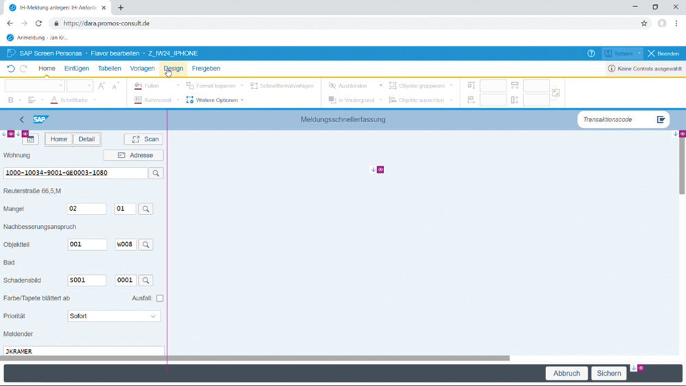
As a principle, the screen for the mobile application should be kept as compact as possible. The less the users have to scroll on their tablets, the better. This means you may decide that you either need more screens or that the transaction must be split across multiple applications so that each application has only one or two functions. A positive side effect is that a simple interface also leads to less data transfer, resulting in better performance. If you want to disperse report creation across different screens, you can use Viewports under the Design tab. You can manage the components used across multiple screens as templates. Typical examples of this are navigation buttons like the Home or Detail buttons, which serve to make the path and location within the application transparent and to make it easier for the craftsman to navigate backwards.

Figure 2: With Viewports you can create various views for your work interface, e.g. for various terminal devices (here: iPhone).
Flexibility on multiple levels: adaptive flavors, scripting + administration
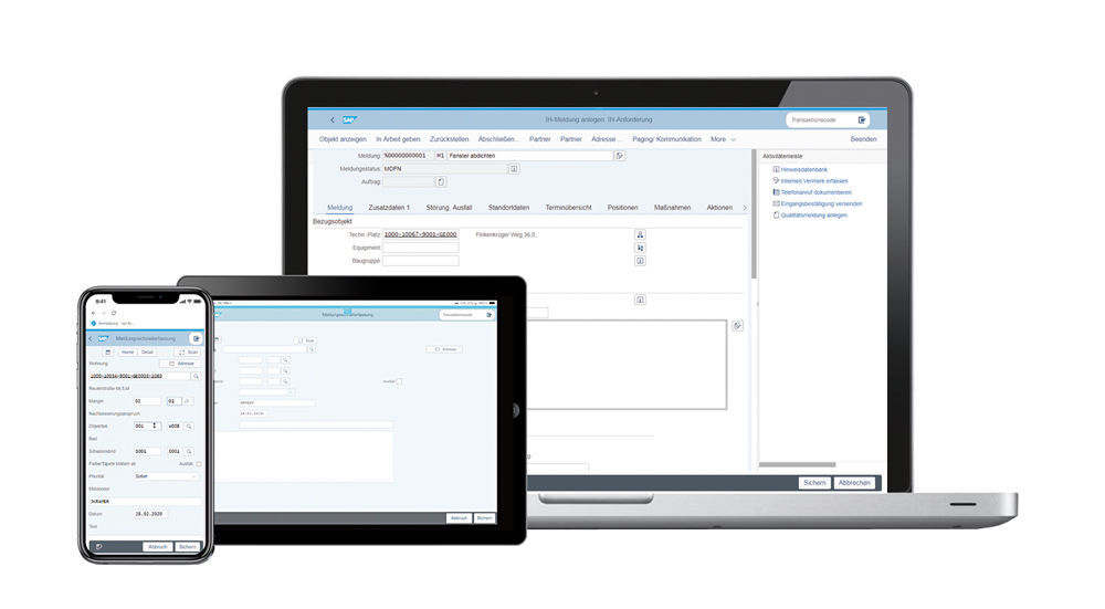
We don’t always want to decide on one specific device for use of the application. How, then, can the application remain compatible with multiple devices? The adaptive flavors function enables responsive application behaviour by allowing you to create flavors for various screen sizes. In this case, the screen switches interfaces at certain markers so that the application can be easily used on both a desktop computer and smartphone.
A real highlight when working in SAP® Screen Personas is the simplified embedding of actions. This enables the automation of tasks that need to be frequently performed. A separate script editor ensures that you can make recordings and link to buttons or even entire screens, e.g. to jump into other transactions or start a transaction during the screen loading time. In our example of report creation, this function comes in handy for pre-filling fields like the short text and sender. When a craftsman reports a defective elevator, for instance, their user ID is already filled in automatically.
SAP® Screen Personas naturally also offers administration options for the screens so that the applications can be assigned to various users and roles or transported to other systems. It is generally advisable to create the buttons in a separate QA system and only transport them to the live system once it is ready. The administrator is also supported by a number of tools for object maintenance, customisation and corporate branding in the admin tool.
Successfully bridging worlds
While there is scope to further improve the search function, and online connectivity remains a key prerequisite for mobile usage, SAP has provided us with a useful technology here. Provided users are working with transactions, the interfaces can be simply and intuitively adjusted. The use of SAPUI5 provides the appearance and user experience of Fiori®. SAP® Screen Personas allows you to quickly and flexibly improve the usability of your SAP® GUIs – with no extensive programming skills or additional licences required.

Author:

Jan Kramer
Expert Consultant
PROMOS consult
Other articles by this author:
- Article "Excel is good, but SAP is better – The digital invoice check sheet for construction services"
- Article "A brilliant new look – Get transactions into shape with SAP® Screen Personas"
- Article "Problem identified, danger averted – effective construction project controlling with the PROMOS construction account"

