Now also available natively for Android – the easysquare customer app for tenants and interested parties
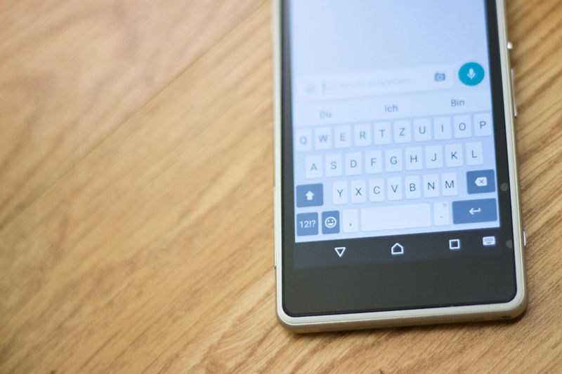
One reason for this popularity is the range of devices available. Android is always free of charge and is thus extremely popular with end device manufacturers. With Samsung, HTC, LG and Motorola, customers have a large variety to choose from. Pricing policies also play an important role. Android devices are available for under 200 euros, while the iPhone 6 Plus can cost up to 999 euros. Due to the strong demand for Android devices, in particular, it is essential to provide a native easysquare customer app for Android for private customers.
When developing native apps, differences between the platforms must be taken into account, because every operating system follows its own logic. This not only applies to interactions with appropriate animations, but also to the design. iOS and Android have considerable differences for developers, which must be considered when designing an app. During the development phase, we thus had a “Team Android” and a “Team iOS”, each of which comprised experts in the field. This is the only way to tailor the app’s development to the operating system in an optimal manner.
In what way are the easysquare Android and iOS apps different?
First of all, there are no differences with regards content. The functional scope is the same in both apps. Tenants can report defects, view master data relating to their rental agreement or receive documents electronically. The electronic forms that tenants use and fill out for this channel of communication are also the same in terms of structure and functions. The development of the design is closely tied to the design guidelines of Apple and Google. Google’s material design guideline specifies that all elements are stacked on top of one another like paper. There are no transparencies, shine, textures or softened surfaces. All elements are purely two dimensional and are stacked in a virtual third dimension.
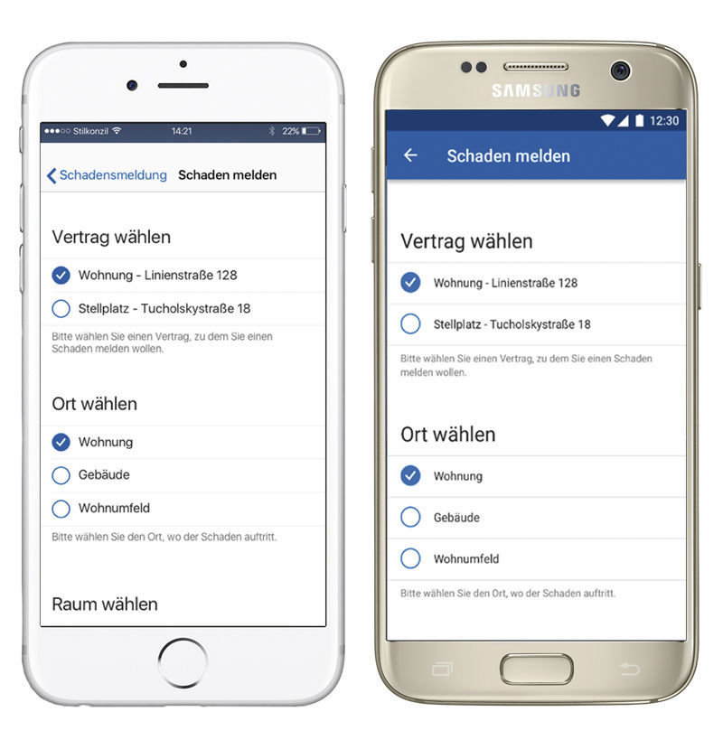
A difference that appears small, but is actually very significant, is the back button. While Android device manufacturers provide this on the device themselves, this button does not exist on the iPhone.
Another typical example is the Android action bar and the iPhone navigation bar located at the top of the screen. The Android action bar has a blue design and allows the user to scroll down beyond this bar. Content is therefore arranged one item below the other in the Android app, and the user scrolls down. On the iPhone, the navigation bar is transparent. For this reason, exactly as much content that fits on the relevant screen is presented. If users now want to enter further information, they go to the next screen using “Next” rather than by scrolling.
Action buttons such as “Log in” or “Report defect” are always shown in Android in the lower right-hand area of the screen. For iOS, these buttons are displayed centred across the whole width of the screen.
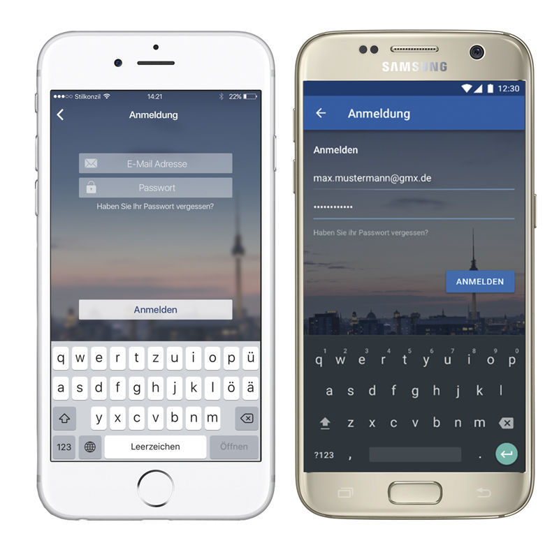
As a result
of the intensive development and design phase, the easysquare customer app for
Android and iOS is tailored perfectly to the relevant platform in terms of
functionality and usability. Tenants can find their way around without the need
for long explanations and they can use the services available to them with
ease.
-
http://de.statista.com/statistik/daten/studie/256790/umfrage/marktanteile-von-android-und-ios-am-smartphone-absatz-in-deutschland/
Author:

Theresia Mussauer
Product Manager
PROMOS consult
Other articles by this author:
- Article "The easysquare customer app for private customers – co-branded and native"
- Article "Top-class tenant change – iModa project implemented by DOGEWO21"
- Article "Now also available natively for Android – the easysquare customer app for tenants and interested parties"
- Article "Renting with easysquare – a simple and modern application for the key process in the housing industry"
