Fiori® is bringing a fresh breath of air
“Mr. Meier, it's good to see your here. I haven't had a reply to my request to put down laminate.” Enquiries like this from tenants frequently confront property managers in their everyday work. However good a property company's overview of its housing stock, customers' expectations are high when it comes to up-to-date master data or asking employees for information. The boundaries between head office, branches and mobile teams on site are blurring and modern technology is finally making it possible to work seamlessly while on the road.
No farewell tears
Access to the company's SAP® systems are no exception. An increasing number of users are accessing SAP® for everyday business use without relying on a specific device. In Fiori® SAP is providing an independent, intuitive user interface and promises an improved user experience overall. The existing SAP GUI interface will soon be a thing of the past; SAP has already announced that no more updates or improvements are planned long term. This step will inevitably force companies to switch to new access technology, though the take-up remains unclear. So what, exactly, does Fiori® entail, and what are the advantages of the solution?
What is Fiori®?
The appearance is the most obvious change: With Fiori® SAP is bidding farewell to its complex, overloaded information screens for which the company has long been known and which hinder navigation (Figure 1). Whether for transactions, reports or analyses, the various apps now offer the same or an even better range of functions but with clearly arranged and organised interfaces thanks to the tile design. The volume of information has been reduced by taking users' roles into account and only displaying the required functions. Rights and role concepts are key to the new design: for the first time, the launch pad can be personalised throughout using authorisations. Applications can be compiled as desired using drag and drop.

Figure 1: Comparing the user interface between SAP Fiori® and SAP GUI clearly reveals the fundamental change in the SAP® application.
However, Fiori® is much more than just an interface. The launch pad is the central starting point for accessing all SAP® systems in a company. Access to the system has been standardised and simplified; it also allows browser-based working from a PC, tablet or smartphone. Fiori® is compatible with all popular browsers, making local installation unnecessary. SAP® creates a completely new user experience through the automation of recurring processes, markers, resubmission of activities, comment functions and an innovative search function.
The user is king
A paradigm shift has taken place: instead of making the functions the main focus, SAP® has put the spotlight on the user experience. In the age of digitisation, when digital applications are essential for practically every business process, the user experience is no longer just a “nice to have”, but a genuine success factor. The success or failure of a company is increasingly decided by faster, more effective and better collaboration.
easysquare workflow goes Fiori®
PROMOS customers are already familiar with many of the above functions from the process control and work basket in easysquare workflow. It therefore makes perfect sense to seamlessly integrate the easysquare workflow for our existing customers into the new interface. First, this means ensuring the technical availability of the easysquare workflow in the browser as the Fiori® app. Second, the design of easysquare workflow is being adapted in line with the functional specifications of the Fiori® launch pad.
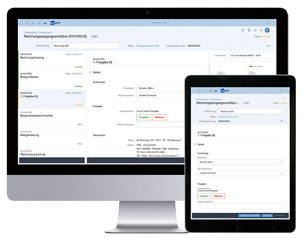
The design concept of Fiori® is being implemented using the UI5 framework and essentially follows five principles: Besides the role-based aspects, personalisation, standardisation and simplification described above, the responsive design also deserves a mention (Figure 2). Responsive design means that all applications automatically adapt to the different usage scenarios, e.g. to mobile devices. The ERP is therefore always accessible even on the move.

Figure 2: easysquare workflow is convenient to use on mobile devices thanks to its responsive design.
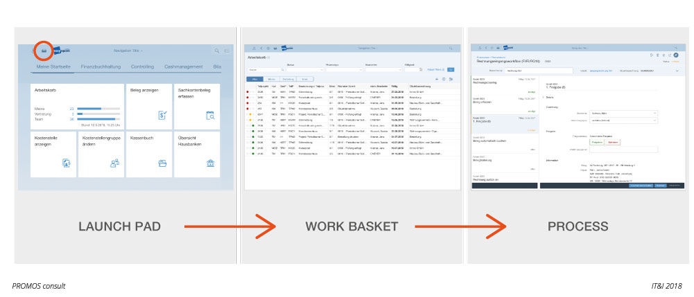
Against this backdrop, the design of easysquare workflow is being changed without sacrificing the basic structure. In future, users will navigate to their personal work basket from the launch pad and will then jump directly into the processes (Figure 3). Applications are now laid out much more clearly, and complex data and processes can also be shown in graphic form using the tiles. New display objects that go beyond the existing dialogue screens and tables expand the analysis functions and provide a rapid insight into the most important key figures.
Outlook
The first mock-up for Fiori® will be available for easysquare workflow as early as autumn 2018. This will give users a very good idea of the look and feel for the new app. As the necessary adaptations to the new design concept are more extensive than just a 1:1 interpretation, further PROMOS solutions will follow from 2019.

Figure 3: It takes a maximum of three clicks to navigate in a work process.
 Figure 3: It takes a maximum of three clicks to navigate in a work process. |
Author:

Björn Schwarz
Director Consulting Financials
PROMOS consult
Other articles by this author:

